Tech Habits — My Extended Bullet Journal Syntax and Why I Built a Brand New App
Plus the “Ultimate Principle for Getting Things Done”
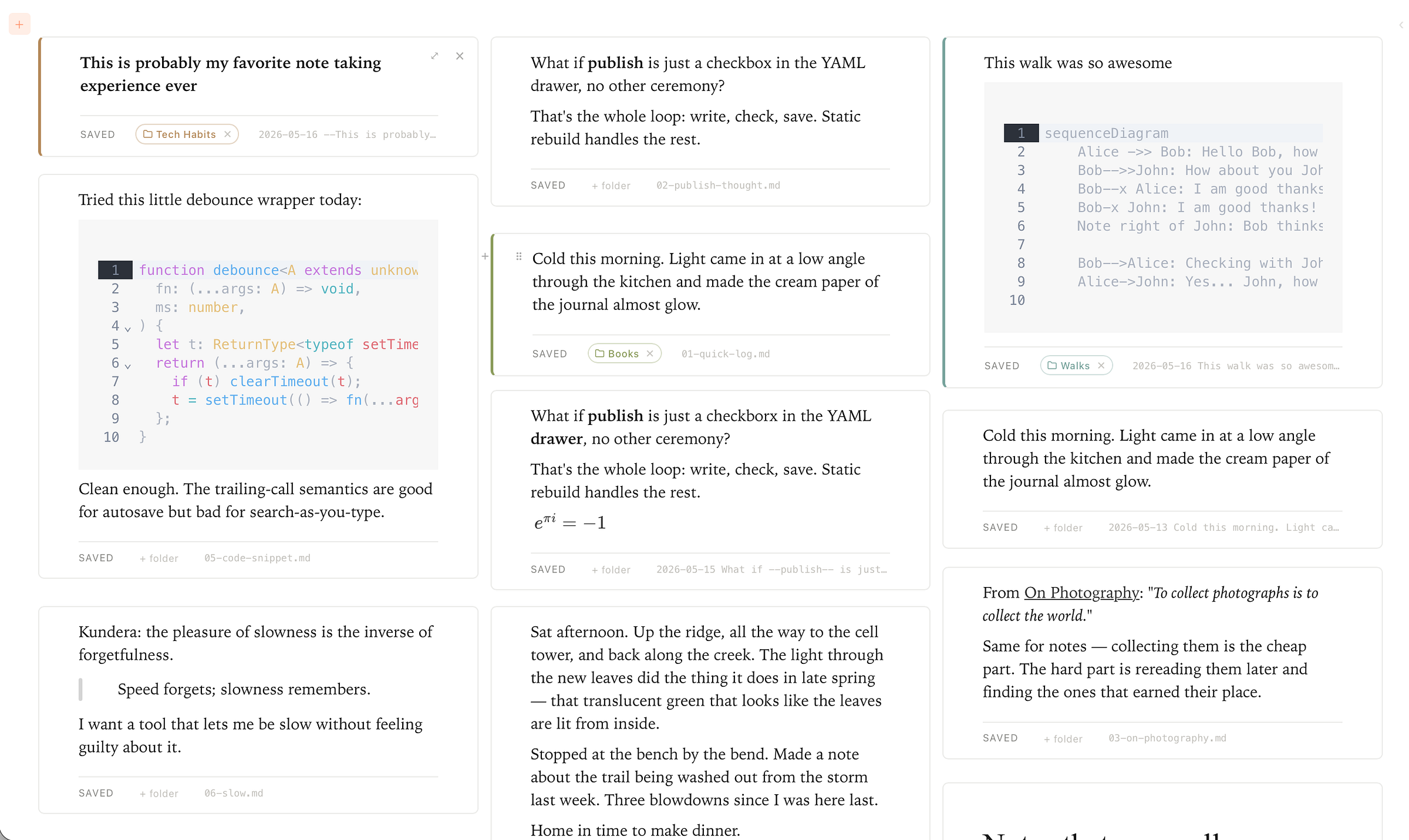
Hello friends! This post has been a long time coming for me. Three threads have been simmering for a few monthsy: an extended bullet journal syntax, the one productivity principle I keep coming back to, and a brand new app that pulls both into one window. They’ve somehow all crossed a boiling point together. So grab some tea and cookies and I’ll try to explain. ☕️🍪
Part One: The Extended Bullet Journal Syntax
When I first got into Bujo, there was a part of me that struggled with it. I felt like if I didn’t follow the system somewhat faithfully, I’d end up just with my normal somewhat useless scribbles in a notebook.
I think the better way to think about methods like Bujo or Johnny Decimal is the following. Treat them not as something you should dogmatically subscribe to, but more as inspiration queued up in the back of your mind. Just some tools that might end up being your favorites over time.
Reading Ryder Carroll’s book on Bujo, the intentions and reflection rituals are what primarily stuck with me, but over the last few months, inspired mostly by my pocket bullet journal, I’ve converged on an extended rapid logging syntax that seems to be working well for me as an extension of my working memory and even resulted something I didn’t expect.
Sometimes I show results of using this syntax as I am brainstorming about some topic with coworkers in my pocket Bullet Journal. We have even gone so far as photographing my pocket Bujo pages so we can continue to brainstorm and collaborate before anything goes digital. Working side-by-side with a pocket notebook open between us without fiddling around with digital apps has a way of connecting me with my colleagues that I’ve appreciated.
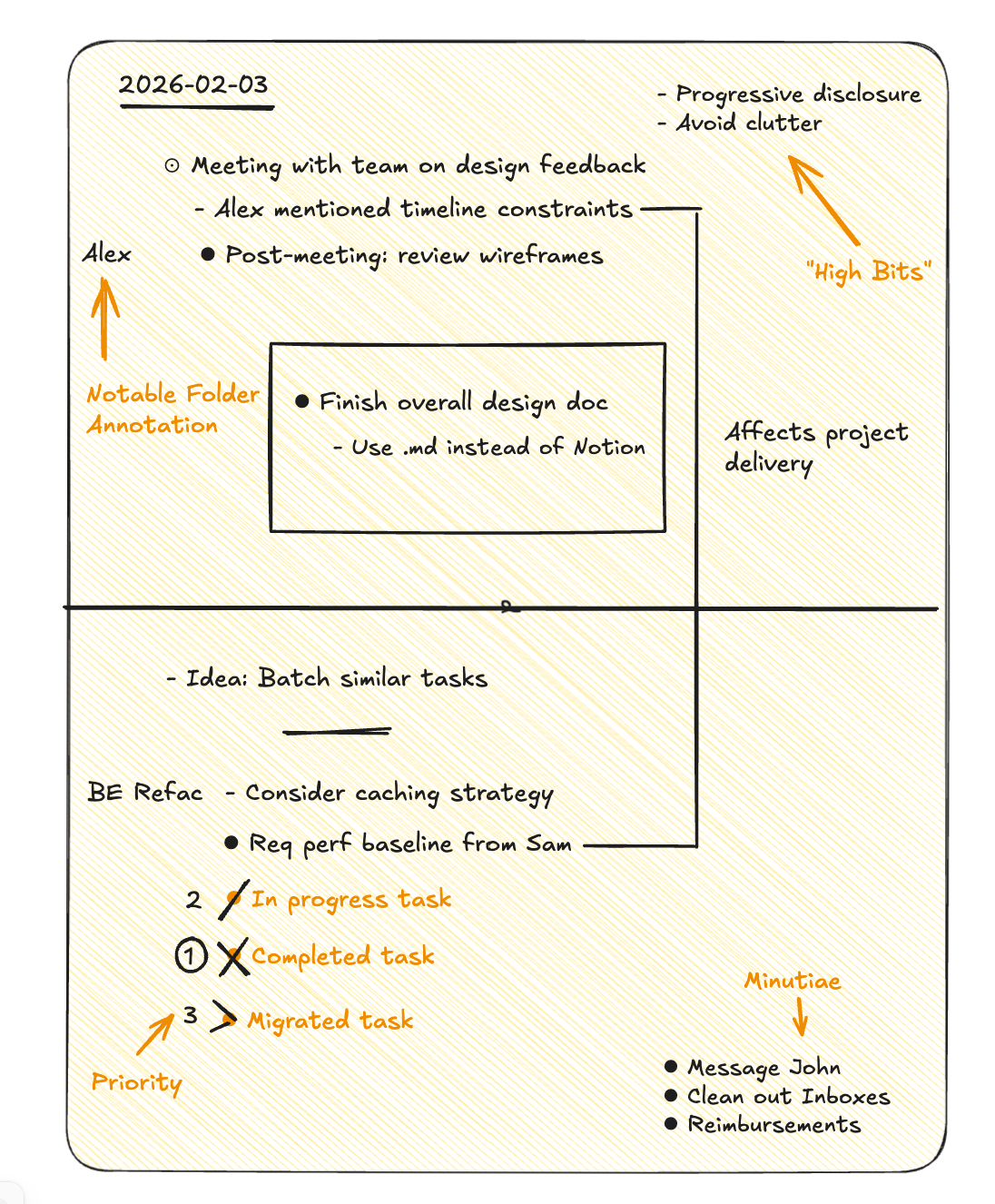
The page anatomy I’ve landed on:
- Left column. Core bullet journal syntax: task bullets (⚫️), event circles (🔘), migration arrows (>), plus extensions like partial-progress markers, priority indicators, relationships between items.
- Left margin.Notable folder annotation. Whichever digital folder a line belongs to gets tagged here, so my ALPPS structure stays visible on paper.
- Top right: “high bits.” A term borrowed from one of my colleagues. I typically have three to five thematic ideas to keep front of mind for a few days.
- Center box. The one or two things that actually matter today. If everything else falls apart, these still happen.
- Bottom right: minutiae. Small to-dos and tiny errands that need a home but shouldn’t pollute the main flow.
See below for an illustration of how this typically looks:
This system bridges physical and digital without making me pick. I photograph the pages so everything ends up searchable in Obsidian, and I generally follow my Pocket Atlas workflow to bridge the divide. The structure travels with me all day: on the desk while I work, in my Obsidian Vault, in my pocket while I think.
One of my colleagues recently told me he loves the idea of physical notebooks but can’t justify them in such a digital world. I get the instinct as that was why I held off on committing to a physical notebook for like 20 years. For me, however, Pocket Bujo has been a superpower. I get the tactile, friction-free experience of writing, plus the permanence and searchability of digital on top. The extended syntax really leans in on the 2D space paper gives me and compliments my working memory perfectly since I can reconstruct parts of the page often without even looking just by focusing mentally on the right portion of the page. The act of physically drawing the symbols and boxes and letters is what I think contributes to the power being so super.
Part Two: The Uber Principle of Getting Things Done
I’m now confident in the answer to this question: “What’s the one tool, and the one way of thinking, that pulls the most weight for getting things done?”
When a day gets dense or when I’m trying to reconstruct last week or last quarter, I always end up back in the same place: the calendar. It’s the one surface that keeps me grounded in what matters most: time. It is always passing, and our job is to order what’s ahead of us and reflect on what’s behind us.
I’ve written about this at length in this post, so I’ll keep the philosophy short: a to-do list disconnected from the calendar is noise. The same list anchored to dates and times and durations becomes a visualizable and digestible plan. A calendar can also serve as a great place to reflect on what you’ve done in a visual way.
Practical version of the principle I keep coming back to:
- Live in one calendar. Google for work, Apple Calendar at home, whatever. If in doubt or in analysis paralysis, pick the one you already check involuntarily, and double down on it. Future you will thank you.
- Curate events manually. Auto-import is convenient and lossy. The friction of dragging an event into place is also the act of agreeing to it.
- Use a single planner downstream of all sources. In my case, I am a proud #PlainTextPlanner and use the plain text way of annotating events used by Obsidian Full Calendar. In this approach all calendars feed into this single planner. Conflicts get resolved here and priorities crystallize here. As a plain text planner, I want to point out that there are many elegant ways to keep a calendar in readable plain text eg. calendar.txt, and Ellane W’s recently discussed todo.txt used as a planner. All of these are portable, outlive whichever app you’re currently using, and can co-exist with tasks.
There are so many tools and techniques sitting around the calendar. A lot of productivity advice will tell you to use something else as your home base: your to-do list, your note-taking app, whatever. But here’s what I’ve found: the further those things are disconnected from your calendar, the less powerful they are. And the closer they are to time, the more useful they become. A floating to-do list is just noise until it is anchored to the calendar: things with dates, things you’re actually doing today or this week. That becomes powerful because it’s grounded in reality.
This is where scales of time matter too. Your daily log, your weekly review, your monthly planning, your quarterly reflections: all of that still comes back to time. And hierarchies like Johnny Decimal or Notable Folders? They exist at larger scales of time. Projects are time-bound. Areas and Categories are things you’re maintaining over longer periods. But they’re all still anchored to time just at a much larger scale.
Hence the practical take listed above: get really comfortable in your calendar. If you use Google Calendar for work and that’s where you tend to live, double down on it. Use it as a place to center yourself. Put all-day events in there. Drag things around. Add a few colors. There’s so much utility that comes just out of that.
Curating into a single planner for the reasons mentioned above is a counterintuitive and powerful next step.
Part Three: Why I Built “Order”
I never expected to write this many words about calendars on personal productivity, much less ship tools around it. I have a few Obsidian plugins I’ve been using for a while: Full Calendar Plus, Kanban Plus. I lean on them daily, but something felt missing.
What I wanted: the same plain text conventions I’d built my life around, viewed through a different, simpler interface. An interface that feels like home when I open it.
Obsidian is excellent. The surface area it covers is also its cost: calendars, drawing canvases, Bases, plugins everywhere. For an interface to think, browse, and eventually publish, I wanted less of everything.
So I built it. I call it ‘Order’ (short for ‘Atlas Order’ and its in very early stages of development) and the tagline is: “Your notes, at home at last.”

Underneath, the data is unchanged: plain text markdown files, YAML front matter, the same portable conventions I’ve used for years. Image pastes write to
The home view is a masonry of cards, a newspaper/Google Keepish-shaped grid, two-to-four columns at desktop widths and one on a phone. Each card is one markdown note. Recent entries float to the top. The layout sits on an 8px row track, so a one-line card stays small and a long note takes the height it needs, with no wasted vertical space between them.
Critically, click any card and you’re editing in it. No modal, no separate page, no editor/viewer toggle. As you type, the card grows and its neighbors slide live to make room — measured against the 8px row, the reflow is invisible. The editor itself (built on Milkdown Crepe) holds to the Typora promise: raw markdown syntax only appears on the line your cursor is touching. Everywhere else, you see the rendered result in a way that’s clean like Medium.
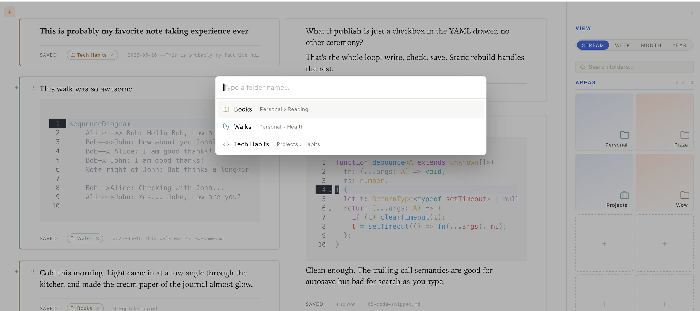
The right sidebar is a drill-down: Areas → Categories → Notable Folders with the Johnny Decimal 10-cap baked into the visual grid as a 2×5 box of tiles. Empty slots show up as dashed outlines. The cap is the design. Click a folder to filter the masonry. Click again to deselect. Two shortcuts that have already wired into muscle memory, eg:
- Cmd-K opens a centered command palette over the whole window. Type a folder name, hit Enter, the masonry filters showing first the main content of the Notable Folder (think like a Wikipedia page) and then a stream of notes ordered by time. I’ve found this model very useful since most Projects, People, and Spaces of interest have main content and a list of ‘updates’ or related ‘notes’.
- Cmd-; toggles the sidebar so you can go full-bleed on a card without losing the chrome forever.
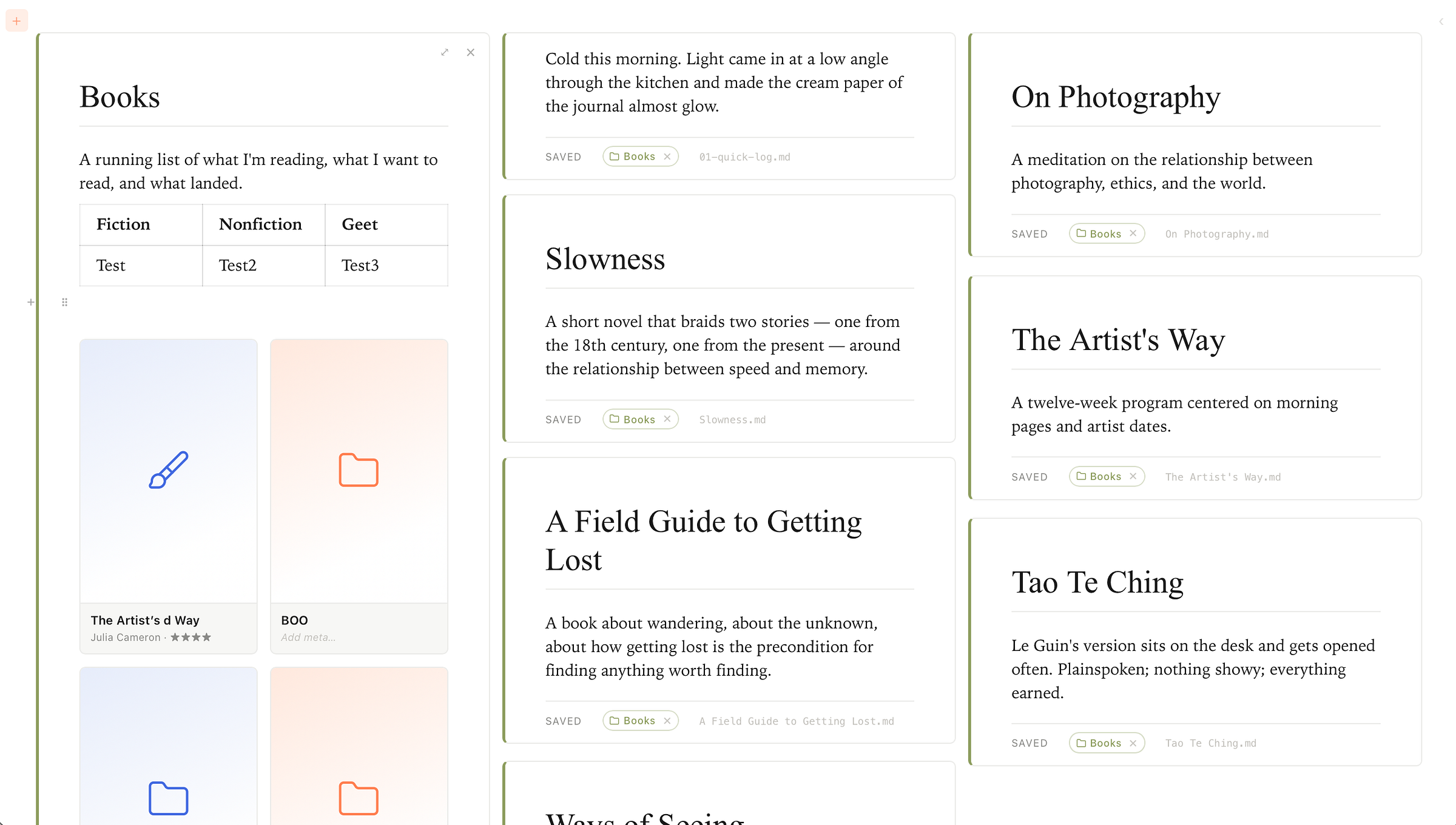
One aspect I’m excited about that’s related to Kanban Plus is what I’m calling list folders: aNotable Folder whose YAML contians list . A simple bulleted list of Wiki links
- [[On Photography]] · Susan Sontag · ★★★★½
- [[Slowness]] · Milan Kundera · ★★★★
- [[A Field Guide to Getting Lost]] · Rebecca Solnit · ★★★★★
is rendered as a card grid. Each card resolves against the linked note: cover image from its image: field, falling back to a Lucide icon over an alternating royal/coral wash when no cover exists. Pick up a card and the others slide out of the way along a FLIP animation, drop it and the underlying markdown bullets reorder on disk live. Click a title to rename. Click the meta line to override. A "+ New" tile at the end appends another item without leaving the page. A Books folder becomes a literal grid of book covers. The inspiration is Obsidian Bases or similar views of Notion Databases.
Given how much I value the use of calendars, you’ll notice on the right-hand side bar, you can switch from a stream of notes to calendar views (Week, Month, and Year). Creating tasks/notes is as easy as dragging over a time period of interest. Click on an event and it hops you over to its location in the stream view so you can take notes or edit what’s already there.
The Year view is the linear strip I ported from a fork of obsidian-full-calendar (twelve month-rows, every day a cell) which has changed how I plan and reflect more than any other view I've tried. Drag an event to move it. Drag across days to create a multi-day span. The calendar views aren’t a separate module bolted into Order. They are a projection of the same notes at different scales.
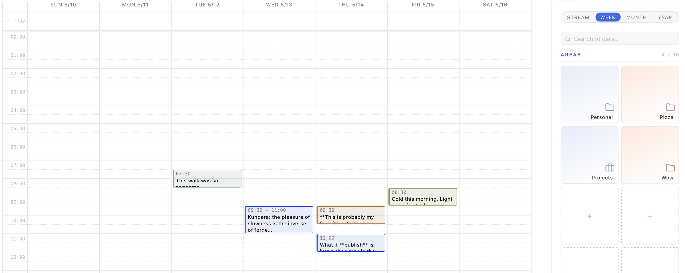
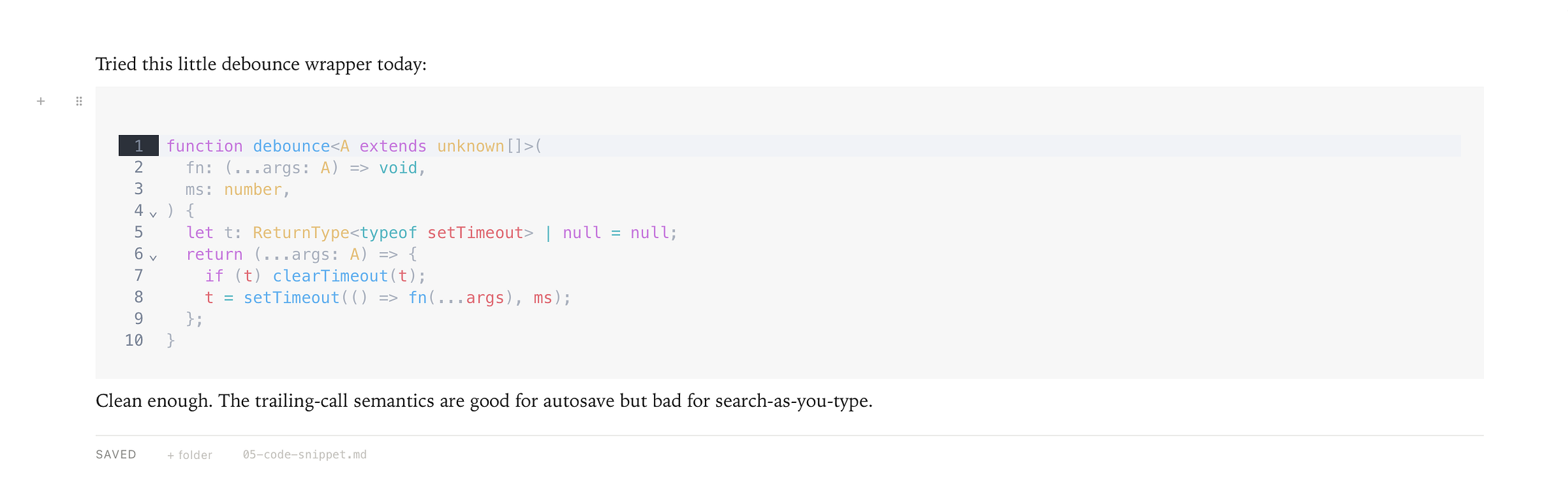
Speed is a feature I’m allergic to compromising on. Startup is instant. View switches (Stream, Week, Month, Year) are a single frame. Edits land on disk inside 600ms via a debounced save and never block the editor.
Same surface on desktop and mobile. The masonry collapses gracefully to a single column on a phone; the same in-place editor, the same sidebar drill-down. Tauri v2 ships the same React frontend to both platforms from one repo, so there’s no parallel port to maintain.
Finally, something that Order has that I am really excited about: publishing. The plan: one toggle in a note’s YAML (public: true), plus a single Publish pill in the topbar that pulses coral when something is pending. Click it, and a static site renders exactly the view you were editing in: the same masonry, the same filtering, the same fonts and palette. The thinking surface and the publishing surface collapsed into one. (Sketch today; feature soon.)
The biggest architectural inspiration is Tolaria. This wonderful effort is proof that an opinionated, AI-inspired, local-first notes app can ship and feel polished. The technical decisions there (Tauri shell, React frontend, plain markdown on disk, Git for versioning) are mostly the same ones I made for Order. I was thinking along these lines before and once I saw Tolaria, I was convinced that this may be a new and useful pattern.
This all loops back to my standards vs. interfaces post: AI hasn’t changed the framework for choosing tools, but it has collapsed the cost of being on the custom end of the interface spectrum. Building Order would have been a six-month project a few years ago. With AI as a pair programmer, it’s been a handful of evenings and a few walks with the dog brainstorming. That’s the only reason a single-person interface like this is worth doing: the construction cost finally dropped below the daily friction it removes.
What Order does, narrowly: streams, calendars, filtering by Notable Folders, in-place editing, list folders as visual surfaces, publishing on the same canvas.
In all honestly this is a tool written by me for me, and more broadly I feel like writing this all down helps me articulate and clarify my own thinking. That being said, if anything in here changes how you approach your own setup: leaning harder into the calendar, photographing pocket pages, building your own small interface on top of conventions you already trust: this would truly make my day, week, month, and even year 😉. And if you end up eventually using Order as it matures, that’d be a sweet cherry on top.
I haven’t been this excited about a tool I’ve built in a long time. A lot of the thinking from this series finally fits literally in one minimalist window. More posts on Order are coming, and I’d love to hear if any of this remotely excites you :-).
Till next time! 🏔️